|
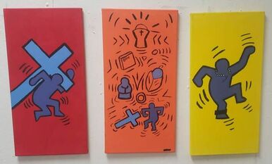
Untitled 1
|
Expedition text
In my piece Untitled 1, inspired by Keith Haring I depict the struggle of handling expectations, and learning to not let them define what kind of person you would end up as. My family is very religious and as such I was brought up to also be very religious. I needed to meet the expectations, and I was okay with that for a while. But after I started to think for myself, I struggled to meet them. I didn't believe what I was being told, after being baptized, done my first communion, was an alter boy for 7 years, and spent weekends at bible study. I don't regret any of it , they made me into the person I am now.
InspirationMy inspiration for my piece Keith Haring was an American artist and social activist known for his illustrative depictions of figures and symbols. Starting as a graffiti artist and then created larger scale works such as colorful murals, many of them commissioned. His imagery has become a widely recognized visual language. His later work often addressed political and societal themes especially homosexuality and AIDS through his own iconography. Keith Haring was a pop artist in the 1970's- 90's and he had a very particular style of painting, he used simplistic figures, symbols and on rare occasions text, to convey his messages. He often used complementary colors that would make an image stand out. Haring's commitment to clean lines and simple images gave new life to figuration in painting, in contrast to the more abstract and conceptual approaches of the previous generation, and the more expressionistic gestural painting of his contemporaries. There are many things from Haring's work that inspired the creation of my own. such as the simplistic design, use of vibrant hues, use of lines around the forms to show movement, emphasis and emotion. I also attempted to give my piece a sense of unity with the colors, like in some of his pieces the colors always relate to one another. Like they all might be primary colors, all the hues could be a combination of two specific colors, or they are all complimentary to each other. |
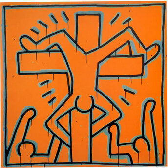
Keith Haring, Untitled. 1984
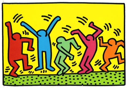
Keith Haring. Untitled. 1989
|
Process
|
First comes building the canvas frame. I grabbed 6 of each the 1 foot long and 2 foot long stretcher bars with interconnecting edges. I connected them and then with a triangle ruler to make sure each frame corner has a 90 degree angle. When each corner is measured I used a stapler gun to staple the corners together. The canvas should be cut several inches wider than the dimensions of the stretcher bars, taking into account the width of each side of the frame, as well. I need this extra canvas to have something to get a grip on to be able to pull and stretch. Then I cut the canvas in the shape of my frames using a very sharp scissors. I centered my frame on the canvas. Laid the canvas out flat on my work surface, smoothing out and cleaning up the canvas as much as possible.
Starting with one side of the canvas and folding it in. I inserted one staple in the middle then along the side, then I rotated the frame and did the exact same thing except stretching it while stapling. Then repeated that process along the other sides and other frames. Now on all the corners fold the extra canvas and staple it to the back of the stretcher bar. I repeated that process with all the canvases. Now that all of the canvases are stretched, I coated each separate canvas with the colors red yellow and orange respectively this is to give it a sense of unity since the mixture of yellow and red make orange. after coding each of the canvases with paint I sketch out but I'm generally going to sketch onto the canvas basic forms and lines. after done sketching what I want to do with each, I start painting the outlines of the forms and lines over the sketch areas. they don't have to be perfect and full like Keith Harings because I can go over them later. after I out lining my lines and shapes with the black paint. I would fill in the forms of the people and some objects in the piece. then I go back and fill in but dirty or unclean lines I painted previously. |
|


ExperimentationI was going to have transparent figures in all three paintings, but then ultimately I decided to color in the shapes to so they would be able to stand out more and give it emphasis from the whole piece. I also used this to be able yo go back to my less than desirable line work in the piece. Giving me a chance to straighten them out, and make them nice and crisp. I did have my name written on the piece but then decided to cover it up with black paint because I wanted to show that even though I know how I feel about religion I choose not to speak out, or at least not publicly.
|
|


Comparison
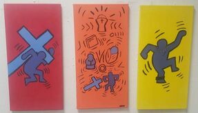
Joel Leija, Untitled 1. 2019
|
Similarities
-Use of complimentary colors - Use of simple lines to create forms -implementation of the cross - use of lines to show emphasis - Use of a basic orange hue Differences -Mine uses more colors -Forms are colored in -Mine is a three part piece (Tryptic) |

Keith Hating, Untitled. 1984
|
Reflection
My piece Untitled 1, in some way is a confession of my struggle and keeping my faith. In the first painting where you can see a purple from of a person carrying a cross. This symbolizes my struggle of trying to carry the weight all the expectations and responsibilities that were given to me by my faith So many that I feel so suffocated, I turn purple. In my second painting it demonstrates some of the things I did in church. these things include first communion, baptism, and my years as an altar boy. But at the bottom you can see the form of a person dropping and walking away from the cross symbolizing the letting go of expectations and responsibilities. In the third painting you can see the form dancing with a rosary around its neck and a ankle monitor which symbolizes that not only do I see celebrate my freedom from religion but also how I'll never forget it at the same time I still feel trapped from it, still feeling suffocated, never being able to escape from it truly.The most difficult parts of making my peace, was how crisp and define I needed to make my lines. It was a very difficult to make the lines with a brush without the brush losing paint halfway through a stroke, making the line look jaded. But the best way to deal with that problem was to just add more paint to my brush and make slow and purposeful strokes.
Citations
Funk, Clayton. “Art, Culture, Music, Film, Television.” Keith Haring, aaep1600.osu.edu/book/20_Haring.php.
“Keith Haring.” Keith Haring, www.haring.com/.
“Untitled, 1984.” Untitled | Keith Haring, www.haring.com/!/art-work/317#.XJlpN7fYq00.
“Keith Haring.” Keith Haring, www.haring.com/.
“Untitled, 1984.” Untitled | Keith Haring, www.haring.com/!/art-work/317#.XJlpN7fYq00.
